Introducing makeitpop, a tool to perceptually warp your data!”#
Note
It should go without saying, but you should never do the stuff that you’re about to read about here. Data is meant to speak for itself, and our visualizations should accurately reflect the data above all else.*
When I was in graduate school, I tended to get on my soapbox and tell everybody why they should stop using Jet and adopt a “perceptually-flat” colormap like viridis, magma, or inferno.
Surprisingly (ok, maybe not so surprisingly) I got a lot of pushback from people. Folks would say “But I like jet, it really highlights my data, it makes the images ‘pop’ more effectively than viridis!”.
Unfortunately it turns out that when a colormap “makes your data pop”, it really just means “warps your perception of the visualized data so that you see non-linearities when there are none”. AKA, a colormap like Jet actually mis-represents the data.
But what does this really mean? It’s difficult to talk and think about coor - especially when it comes to relating color with objective relationships between data. Rather than talking about colormaps in the abstract, what if we could visualize the warping that is performed by colormaps like Jet?
In this post I’ll show that this is possible! Introducing makeitpop.
What does makeitpop do?#
Makeitpop lets you apply the same perceptual warping that would normally be accomplished
with a colormap like Jet, but applies this warping to the data itself! This lets us
get the same effect with a nice linear colormap like viridis!
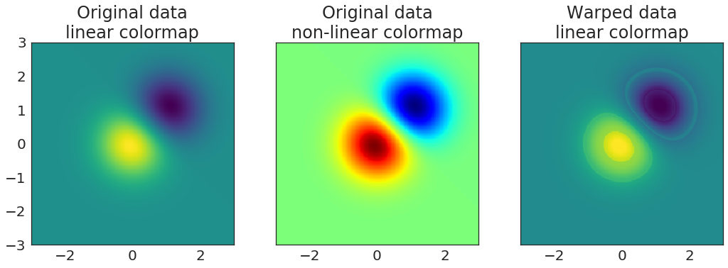
For example, let’s take a look at the image demo in matplotlib. In it, we create two blobs that are meant to be visualized as an image. We’ll visualize this with our old friend viridis.
# Create a mesh grid with two gaussian blobs
delta = 0.025
x = y = np.arange(-3.0, 3.0, delta)
X, Y = np.meshgrid(x, y)
Z1 = np.exp(-X**2 - Y**2)
Z2 = np.exp(-(X - 1)**2 - (Y - 1)**2)
Z = (Z1 - Z2) * 2

# Visualize it
fig, ax = plt.subplots(figsize=(5, 5))
ax.imshow(Z, cmap=plt.cm.viridis,
          origin='lower', extent=[-3, 3, -3, 3],
          vmax=abs(Z).max(), vmin=-abs(Z).max())
ax.set(title="Original data\nlinear colormap")
plt.tight_layout()
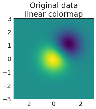
Hmmm, not too bad…but it’s a bit boring, no? Why can’t we make it snazzier? I know, let’s use Jet!
Show code cell source
# Visualize our data
fig, ax = plt.subplots(figsize=(5, 5))
ax.imshow(Z, cmap=plt.cm.jet,
          origin='lower', extent=[-3, 3, -3, 3],
          vmax=abs(Z).max(), vmin=-abs(Z).max())
ax.set(title="Original data\nnon-linear colormap")
plt.tight_layout()
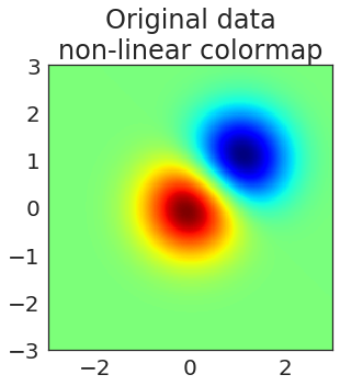
Oooh now that’s what I’m talking about. You can clearly see two peaks of significant results at the center of each circle. Truly this is fit for publishing in Nature.
But…as you all know, this data only looks better because we’ve used a colormap that distorts our perception of the underlying data.
Let’s illustrate this by making it pop!
Show code cell source
# Pop the data!
Z_popped = makeitpop(Z, 'jet', scaling_factor=20)

# Visualize the warped data
fig, ax = plt.subplots(figsize=(5, 5))
ax.imshow(Z_popped, cmap=plt.cm.viridis,
          origin='lower', extent=[-3, 3, -3, 3],
          vmax=abs(Z).max(), vmin=-abs(Z).max())
ax.set(title="Warped data\nlinear colormap")
plt.tight_layout()
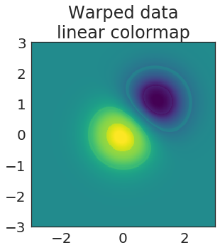
Excellent! We’re using a nice, perceptually-flat colormap like viridis, but we’ve attained an effect similar to the one that Jet would have created!
Now let’s visualize all three next to each other so that we can see the total effect:
Show code cell source
fig, axs = plt.subplots(1, 3, figsize=(15, 5), sharey=True)

kws_img = dict(extent=[-3, 3, -3, 3], origin='lower',
               vmax=abs(Z).max(), vmin=-abs(Z).max())

# Raw data with a perceptually-flat colormap
axs[0].imshow(Z, cmap=plt.cm.viridis, **kws_img)
axs[0].set(title="Original data\nlinear colormap")

# Raw data with a perceptually-distorted colormap
axs[1].imshow(Z, cmap=plt.cm.jet, **kws_img)
axs[1].set(title="Original data\nnon-linear colormap")

# Distorted data with a perceptually-flat colormap
axs[2].imshow(Z_popped, cmap=plt.cm.viridis, **kws_img)
axs[2].set(title="Warped data\nlinear colormap")

plt.tight_layout()
Let’s see it in the real world#
Thus far I’ve been using toy examples to illustrate how makeitpop works. Let’s see how things look on an actual dataset collected in the wild.
For this, we’ll use the excellent nilearn package. This has a few datasets we can download to demonstrate our point. First we’ll load the data and prep it:
from nilearn import datasets
from nilearn import plotting
import nibabel as nb

# Load a sample dataset
tmap_filenames = datasets.fetch_localizer_button_task()['tmaps']
tmap_filename = tmap_filenames[0]

# Threshold our data for viz
brain = nb.load(tmap_filename)
brain_data = brain.get_fdata()
mask = np.logical_or(brain_data < -.01, brain_data > .01)
/home/choldgraf/anaconda/envs/dev/lib/python3.6/site-packages/h5py/__init__.py:36: FutureWarning: Conversion of the second argument of issubdtype from `float` to `np.floating` is deprecated. In future, it will be treated as `np.float64 == np.dtype(float).type`.
  from ._conv import register_converters as _register_converters
/home/choldgraf/anaconda/envs/dev/lib/python3.6/site-packages/numpy/lib/npyio.py:2266: VisibleDeprecationWarning: Reading unicode strings without specifying the encoding argument is deprecated. Set the encoding, use None for the system default.
  output = genfromtxt(fname, **kwargs)
Next, we’ll create a “popped” version of the data, where we apply the non-linear warping properties of Jet to our data, so that we can visualize the same effect in linear space.
# Create a copy of the data, then pop it
# We'll use a scaling factor to highlight the effect
brain_popped = brain_data.copy()
brain_popped[mask] = makeitpop(brain_popped[mask], colormap='jet', scaling_factor=75)
brain_popped = nb.Nifti1Image(brain_popped, brain.affine)
Now, I’ll plot the results for each.
First, we’ll see the raw data on a linear colormap. This is the way we’d display the data to show the true underlying relationships between datapoints.
Next, we’ll show the same data plotted with Jet. See how many more significant voxels there are! (/s)
Finally, we’ll plot the “popped” data using a linear colormap (viridis). This accurately represents the underlying data, but the data itself has been distorted!
Show code cell source
for i_brain, name in [(brain, 'original'), (brain, 'original (jet)'), (brain_popped, 'popped brain')]:
    cmap = 'jet' if name == 'original (jet)' else 'viridis'
    plotting.plot_stat_map(i_brain, cmap=cmap, vmax=7, display_mode='x',
                           title=name, cut_coords=np.linspace(20, 50, 5, dtype=int))
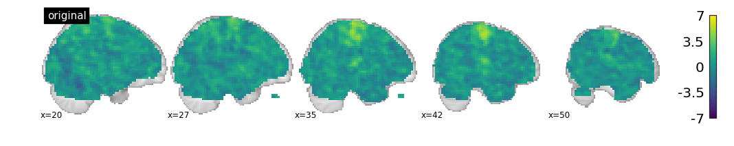
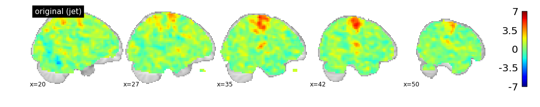
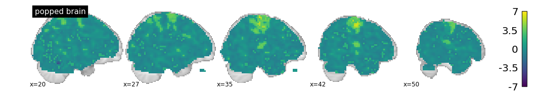
As you can see, different kinds of results show up when your perception of the data is affected by the colormap.
How does this work?#
OK, so what is the black voodoo magic that makes it possible to “make your data pop”?
It all comes down to your visual system. I won’t go into a ton of detail because Nathaniel Smith and Stefan van der Walt already gave a great talk about this, however here is a lay-person’s take:
When we use color to represent data, we are mapping a range of data values onto a range of color values. Usually this means defining a min / max for our data, then mapping data values linearly from 0 to 1, and finally mapping those values onto RGB values in a colormap.
Implicit in this process is the idea that stepping across our space in the data equates to an equal step in our perception of the color that is then chosen. We want a one-to-one mapping between the two.
Unfortunately, this isn’t how our visual system works.
In reality, our brains do all kinds of strange things when interpreting color. They are biased to detect changes between particular kinds of colors, and biased to miss the transition between others.
Jet uses a range of colors that highlight this fact. It transitions through colors such that linear changes in our data are perceived as nonlinear changes when we look at the visualization. That’s what makes the data “pop”.
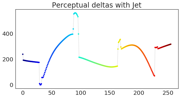
Perceptual “delta” curves#
You can determine the extent to which a colormap “warps” your perception of the data by calculating the “perceptual deltas” as you move across the values of a colormap (e.g. as you move from 0 to 1, and their corresponding colors).
These deltas essentially mean “how much is the next color in the colormap perceived as different from the current color?” If your colormap is perceptually flat, the delta will be the same no matter where you are on the range from 0 to 1.
Let’s see what the deltas look like for Jet:
Show code cell source
def plot_colormap_deltas(deltas, cmap, ax=None):
    if ax is None:
        fig, ax = plt.subplots(figsize=(10, 5))
    xrange = np.arange(len(derivatives))
    sc = ax.scatter(xrange, deltas, c=xrange, vmin=xrange.min(), vmax=xrange.max(),
                    cmap=plt.cm.get_cmap(cmap), s=20)
    ax.plot(xrange, deltas, c='k', alpha=.1)
    return ax

ax = plot_colormap_deltas(derivatives['jet'].values, 'jet')
ylim = ax.get_ylim()  # So we can compare with other colormaps
ax.set(title="Perceptual deltas with Jet")
[Text(0.5,1,'Perceptual deltas with Jet')]
Oops.
As you can see, Jet does not have a flat line for perceptual deltas. Each “jump” you see above is a moment where Jet is actually mis-representing differences in the data. For shame, Jet.
Now let’s see what this looks like for viridis:
Show code cell source
ax = plot_colormap_deltas(derivatives['viridis'].values, 'viridis')
ax.set(ylim=ylim, title="Perceptual deltas with viridis");
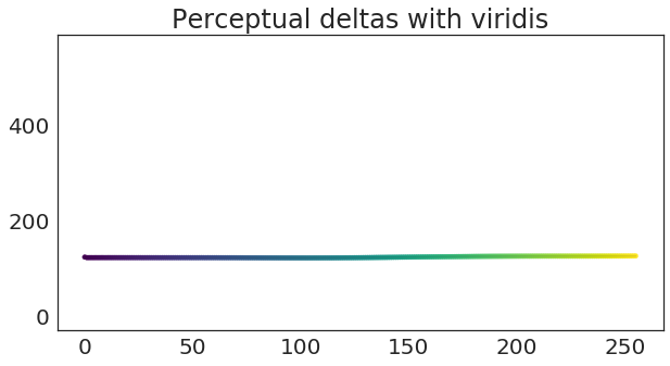
Ahhh, sweet, sweet linear representation of data.
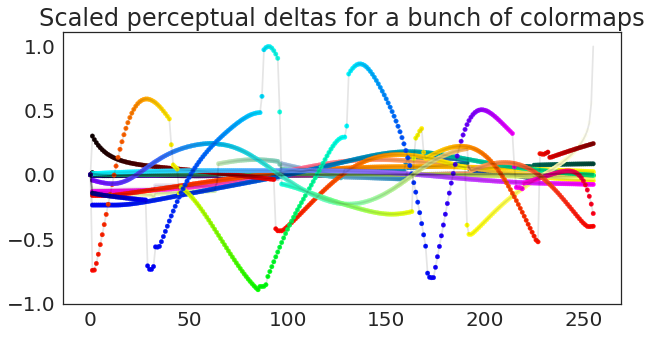
In case you’re curious, here are the “perceptual deltas” for several colormaps. In this case, I’ve centered them and scaled each by the variance of the largest colormap, so that they are easier to compare.
Show code cell source
fig, ax = plt.subplots(figsize=(10, 5))
for cmap, deltas in derivatives_scaled.items():
    if cmap == 'linear':
        continue
    ax = plot_colormap_deltas(deltas.values, cmap, ax=ax)
ax.set(title="Scaled perceptual deltas for a bunch of colormaps");
We can even warp 1-dimensional data!#
Let’s see how this principle affects our perception with a different kind of visual encoding. Now that we know these perceptual warping functions, we can get all the data-warping properties of jet, but in one dimension!
Here’s a line.
Show code cell source
fig, ax = plt.subplots(figsize=(5, 5))
x = np.linspace(0, 1, 100)
ax.plot(x, x, 'k-', lw=8, alpha=.4, label='True Data')
ax.set_title('Totally boring line.\nNothing to see here.');
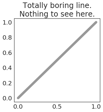
Ew. Boring.
Now, let’s make it pop! We’ll loop through a few colormaps, applying its color warping function to the y-axis of our line as we step through it.
Show code cell source
names = ['jet', 'viridis', 'rainbow', 'spring', 'hsv']
fig, ax = plt.subplots(figsize=(10, 10))

x = np.linspace(0, 1, 1000)
ax.plot(x, x, 'k-', lw=12, alpha=.4, label='True Data')
for nm in names:
    ax.plot(x, makeitpop(x, colormap=nm, scaling_factor=40), label=nm, lw=4)
    ax.legend(loc=(1.05, .6))
ax.set_title('Making data "pop" is fun!')
Text(0.5,1,'Making data "pop" is fun!')
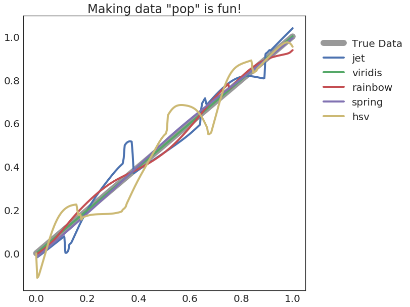
As you can see, data looks much more interesting when it’s been non-linearly warped! It looks particularly striking when you see it on a 1-D plot. This is effectively what colormaps such as Jet are doing in 2 dimensions! We’re simply bringing the fun back to 1-D space.
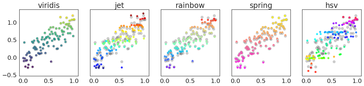
Let’s see how it looks on some scatterplots. We’ll plot the raw data in the background in grey, and the “popped” data in front in color. Notice how some colormaps distort the y-values more than others.
Show code cell source
names = ['viridis', 'jet', 'rainbow', 'spring', 'hsv']
fig, axs = plt.subplots(1, len(names), figsize=(20, 4), sharex=True, sharey=True)
x = np.linspace(0, 1, 100)
y = x + np.random.randn(len(x)) * .2
for name, ax in zip(names, axs):
    ax.scatter(x, y, c='k', s=80, alpha=.2)
    ax.scatter(x, makeitpop(y, name, 40), c=y, s=40, alpha=.8, cmap=plt.get_cmap(name))
    ax.set(title=name)
So what should we do?#
The reason that I wrote this blog post (and made this silly package) is to illustrate what we’re really doing when we use a colormap like Jet, and to highlight the importance of using a perceptually-flat colormap. Sure, we want to choose the visualization that best-makes our point, but a colormap like Jet is actively mis-representing your data. You’d never consider changing the raw data values so that an effect popped out, and you’d never alter the y-values of a scatterplot so that something shows up. Well, this is perceptually what you’re doing when you visualize 2-D data with Jet.
Here are a few things to keep in mind moving forward:
Don’t use Jet
If you review a paper or are an editor for a journal, consider asking authors to use a perceptually flat colormap (this is usually just a matter of changing
cmap='viridis'!)Be aware of the effects that color has on the point you’re trying to make. Perceptual warping is just one of many potential issues with choosing the right color.
Wrapping up#
I hope that this post has been a fun and slightly informative take on the nuances of colormaps, and the unintended effects that they might have.
So, tl;dr:
Jet (and many other colormaps) mis-represent your perception of the data
Perceptually flat colormaps like Viridis, Magma, Inferno, or Parula minimize this effect
You can calculate the extent to which this mis-representation happens as you move along the colormap
We can then use this function to distort data so that the data itself contains this mis-representation
But doing so would be super unethical, so in the end you should stop using jet and use a perceptually-flat colormap like viridis.
If you’d like to check out the makeitpop package, see the GitHub repo here. In addition, all of the examples in this post are runnable
on Binder! You can launch an interactive session with this code by clicking on the Binder button
at the top of this page!
Addendum: Ok but how does makeitpop actually work?#
In this section I’ll describe the (admittedly hacky) way that I’ve written makeitpop.
As I mentioned before, all the makeitpop code is on GitHub and
Pull Requests are more than welcome to improve the process (I’m looking at you, “histogram matching” people!)
Here’s what makeitpop does:
Collects a list of the “perceptual deltas”. These are calculated from the equations given in
viscm, which was released as a part of the original work that createdviridis.Centers each colormap’s deltas at 0.
Scales each colormap’s deltas by the largest variance across all colormaps. This is to make sure that warping the data is done with the relative differences of each colormap in mind.
When
makeitpopis called, the function then:Scales the input data linearly between 0 and 1
Calculates the point-by-point derivative for linearly spaced points between 0 and 1 (the derivative is the same for all points here).
Multiplies each derivative by the scaled perceptual deltas function, plus an extra scaling factor that accentuates the effect.
Adds each value to the scaled input data.
Un-scales the altered input data so that it has the same min/max as before.
There are plenty of ways you could do this more effectively (for example, by matching empirical CDFs and using linear interpolation to map the delta function of one colormap onto the delta function for another colormap). If you’d like to contribute or suggest something, feel free to do so! However, I’m just creating this package to highlight an idea, and think this approach gets close enough with relatively little complexity.
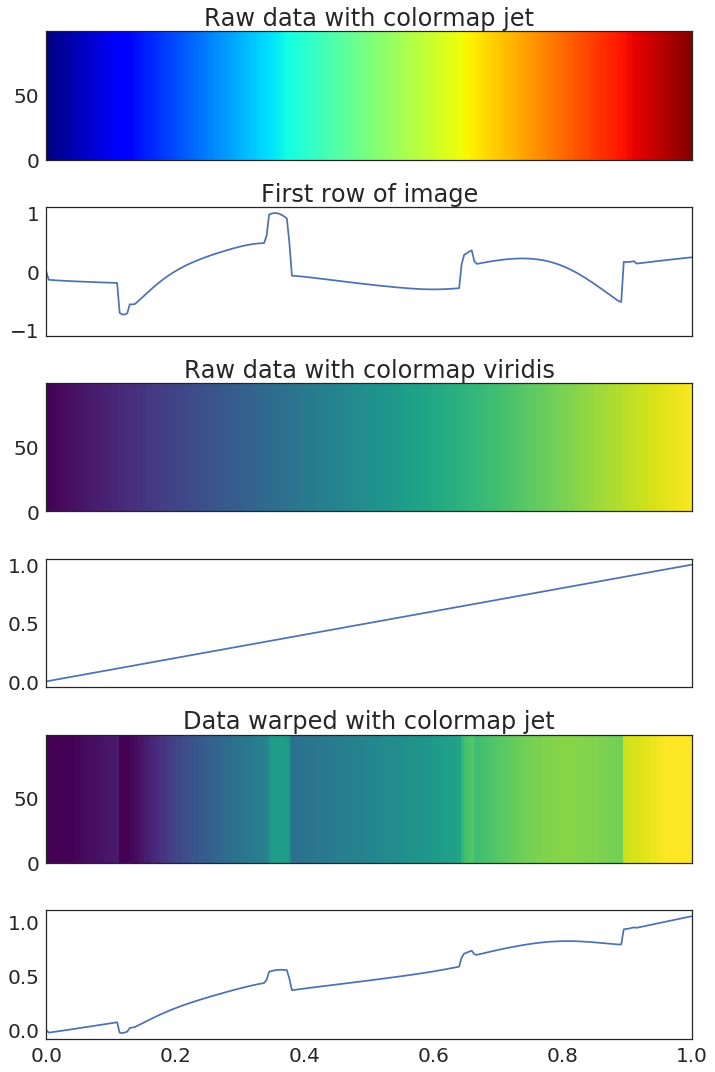
Some extras#
Here’s a viz that will let you visualize how different colormaps distort data. We’ll show a gradient of linearly-spaced values, both using a warping colormap such as “jet” and a linear colormap like “vidiris”. Then, we’ll “pop” the data and re-visualize with viridis.
Show code cell source
# Create a gradient of datapoints
data = np.linspace(0, 1, 256)
data = np.tile(data, [100, 1])

# Pop the data
cmap_warping = 'jet'
scaling_factor = 50
data_popped = makeitpop(data, cmap_warping, scaling_factor)

# Visualize
fig, axs = plt.subplots(6, 1, figsize=(10, 15), sharex=True)
axs[0].pcolormesh(derivatives_scaled.index, range(len(data)), data, vmin=0, vmax=1, cmap=cmap_warping)
axs[0].set(title="Raw data with colormap {}".format(cmap_warping))
axs[1].plot(derivatives_scaled.index, derivatives_scaled[cmap_warping].values)
axs[1].set(xlim=[0, 1], ylim=[-1.1, 1.1], title="First row of image")

axs[2].pcolormesh(derivatives_scaled.index, range(len(data)), data, vmin=0, vmax=1, cmap='viridis')
axs[2].set(title="Raw data with colormap {}".format('viridis'))
axs[3].plot(derivatives_scaled.index, data[0])
axs[3].set_xlim([0, 1])

axs[4].pcolormesh(derivatives_scaled.index, range(len(data)), data_popped, vmin=0, vmax=1, cmap='viridis')
axs[4].set(title="Data warped with colormap {}".format(cmap_warping))
axs[5].plot(derivatives_scaled.index, data_popped[0])
axs[5].set_xlim([0, 1])
plt.tight_layout()